Site Header
The header appears consistently across all pages of your website. It typically contains your logo (text or image), navigation menu, phone number or call-to-action button, optional custom text, and social media buttons. To edit it, hover over the header in edit mode and click the edit icon.

Header Layout
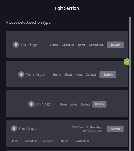
To change your header layout, click the sections icon in the left panel and select from the available layout options. The header layout updates automatically. Different layouts support different features — some include space for custom text, while others are more compact.
Header Editing Tutorial
Designing the Header
Header design covers two areas: Header Style (colour scheme, transparency, fixed positioning) and Header Layout (arrangement of logo, menu, and CTA). Access these by hovering over the header and clicking the edit button, then selecting 'Header style'. You can customise colours, transparency, navigation alignment, font properties, and spacing.
Adding or Changing Your Logo
- 1Click the pen icon next to Save in the header
- 2Select 'Logo'
- 3Enter text for a text logo, or upload an image for a graphic logo
- 4Adjust the logo height for desktop and mobile views
- 5Click 'Apply'
Logo Tutorial
Keep your logo proportional. Making it too large can distract from the page content and take up valuable screen real estate, especially on mobile devices.
Adding a Phone Number or Call to Action
Click the pen icon and select 'Button/Phone (CTA)'. Choose between:
Phone: Enter a phone number for click-to-call on mobile devices
URL (Button): Add button text and a link to an internal page or external URL
You can customise the button style and colour scheme to match your design.
Phone: Enter a phone number for click-to-call on mobile devices
URL (Button): Add button text and a link to an internal page or external URL
You can customise the button style and colour scheme to match your design.
Custom Text
Custom text is used for adding additional information like an address or a detailed call-to-action. This feature is only available on header layouts that provide sufficient space. To add custom text, open the header editor and look for the 'Custom Text' option. If your current layout does not support it, switch to a layout that includes a custom text area.
Not all header layouts accommodate custom text fields due to space constraints. If you cannot see the option, try selecting a different header layout.
iOS Home Screen Icon
When visitors save your site to their iPhone or iPad home screen, iOS displays a dedicated icon. You can set this icon by uploading a custom image and adding a small code snippet to your site.
How to Add an iOS Home Screen Icon
- 1Create a PNG image exactly 150 × 150 pixels
- 2Name the file <strong>apple-touch-icon.png</strong> (case-sensitive)
- 3Open the file manager in your Limecube dashboard
- 4Create a folder called <strong>Misc</strong> if one does not already exist
- 5Upload the image into the Misc folder
- 6Navigate to Settings → Head Code (or the equivalent code injection area)
- 7Paste the following line into the <head> section: <code><link rel="apple-touch-icon" href="Misc/apple-touch-icon.png"></code>
- 8Save and publish your site
Verify the icon by opening your site in Safari on an iOS device, tapping the Share button, and selecting 'Add to Home Screen'. The custom icon should appear instead of a screenshot.
Adding a Favicon
A favicon is the small icon displayed on the browser tab next to your page title. To add one: open the header editor, find the 'Favicon' option, browse for your image, and click 'Apply'. Use a square image (at least 32×32 pixels) for best results.
Adding Search
- 1Hover over the header in admin mode
- 2Click the edit button
- 3Choose 'Search element'
- 4Toggle search on
- 5Select which page displays search results
Header Features Tutorial
Troubleshooting
Keep navigation clear and straightforward. Use descriptive labels (not 'Page 1') and preview on multiple devices to ensure the header looks good everywhere.
Was this helpful?
Related Articles
Using the Style Editor
Customise colours, fonts, button styles, and more — make your site match your brand perfectly.
6 min readVideo
Colour Palette Tool
Apply a consistent colour set across your entire website using Limecube's built-in palette tool.
4 min readVideo
Creating Social Media Buttons
Add social media links to your header, footer, or floating on the page — connect visitors to your social profiles.
4 min read
Still need help?
Submit a Support Ticket